Models and variables statistics
Report #1: Data source
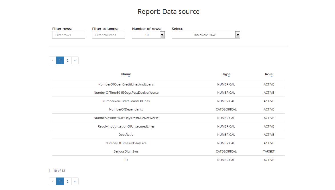
The first report shows a list of variables with types and roles. The table includes:
- Name: variable’s name
- Type: variable’s type (categorical or numerical)
- Role: variable’s role (Active / Obligatory / Target / ID, details on variable’s roles can be found in Chapter Step 3: Entering variables settings)
You can filter the information in the table by:
- Rows: select only those rows where variables names contain letters you typed in the filter
- Columns: display only selected columns
- Number of rows: display the selected number of rows
You can also sort data from lowest to highest and vice versa by column.
Report #2: Data split
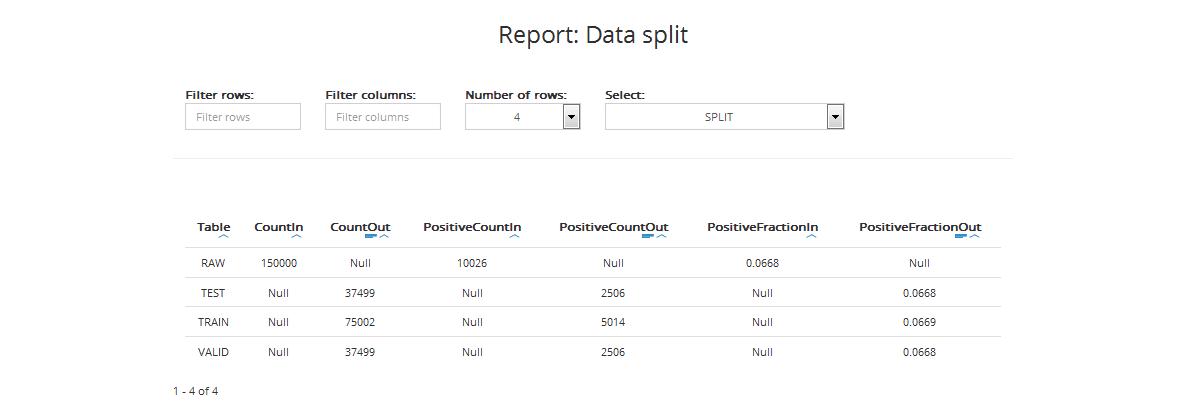
The second report shows statistics regarding division of the source data into:
- Training dataset: used for model building
- Validation dataset: used to choose the best model from all models built during the process
- Testing dataset: used for final presentation and quality assessment of the best model chosen by ABM
The table includes:
- Table: data category: testing data (TEST), training data (TRAIN), validation data (VALID)
- CountIn: number of records in each category (source file)
- CountOut: number of records in each category after division
- PositiveCountIn (for classification projects): number of positive target values in each category in the input dataset
- PositiveCountOut (for classification projects): number of positive target values in the selected samples of each dataset (training, validation, and testing)
- PositiveFractionIn (for classification projects): the fraction of positive target values in each category in the input dataset
- PositiveFractionOut (for classification projects): the fraction of positive target values in the selected samples of each dataset (training, validation, and testing)
You can filter the information in the table by:
- Rows: select only those rows where variables names contain letters you typed
- Columns: display only the selected columns
You can also sort data by column from lowest to highest and vice versa and see data visualisation.
Report #3: Data sampling
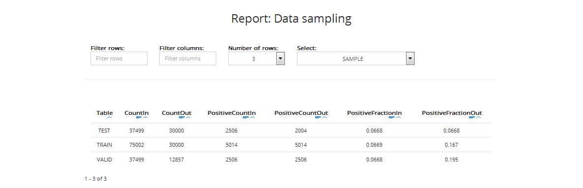
The next report shows statistics regarding training, validation, and testing datasets before and after the sampling procedure. The table includes:
- Table: data category: testing data (TEST), training data (TRAIN), validation data (VALID)
- CountIn: number of records in each category in the input dataset
- CountOut: number of records in each category in the representative subset (sample) used for model building
- PositiveCountIn (for classification projects): number of positive target values in each category in the input dataset
- PositiveCountOut (for classification projects): number of positive target values in the selected samples of each dataset (training, validation, and testing)
- PositiveFractionIn (for classification projects): the fraction of positive target values in each category in the input dataset
- PositiveFractionOut (for classification projects): the fraction of positive target values in the selected samples of each dataset (training, validation, and testing)
You can filter the information in the table by:
- Rows: select only those rows where variables names contain letters you typed in the filter
- Columns: display only selected columns
You can also sort each column in the table from lowest to highest and vice versa by value or absolute value and see data visualisation.
Report #4: Exploratory data analysis
The next report shows descriptive statistics regarding variables in the training and validation sample.
Descriptive statistics for training sample
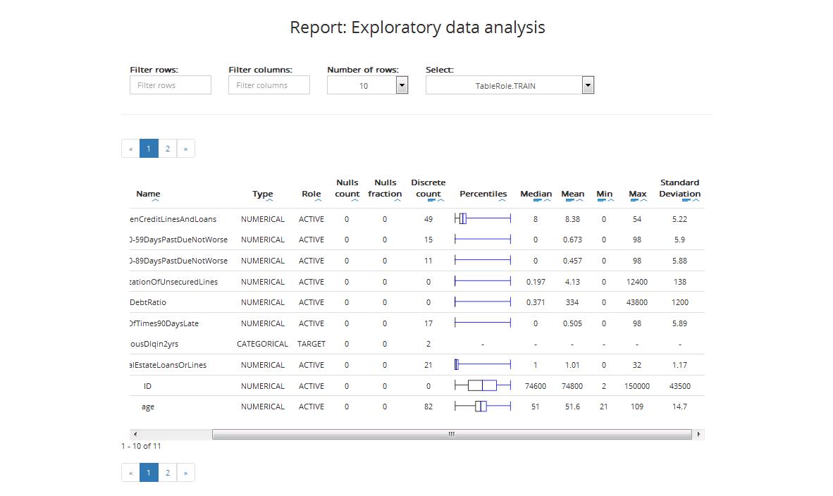
The table for the training sample includes:
- Name: variable’s name
- Type: variable’s type (categorical or numerical)
- Role: variable’s role (Active / Obligatory / Target / ID, details on variable’s roles can be found in Chapter Step 3: Entering variables settings)
- Nulls count: number of nulls
- Nulls fraction: fraction of nulls in the dataset
- Discrete count: maximum number of levels for categorical variables. Variables with more levels will be ignored in the further modelling process
- Percentiles: box plot, where:
- Boxplot depicts 1st and 3rd quartiles
- Middle vertical line depicts median
- Whiskers depict variability outside the upper and lower quartiles (the longer they are the stronger the skewness in the given direction)
- Points depict outliers
- Median: the middle number of the group when they are ranked in order
- Minimum (Min): minimal value of the given variable
- Maximum (Max): maximal value of the given variable
- Standard Deviation: a measure that is used to quantify the amount of variation or dispersion of a set of data values
You can filter the information in the table by:
- Rows: select only those rows where variables names contain letters you typed in the filter
- Columns: display only selected columns
- Number of rows: display selected number of rows
You can also sort each column in the table from lowest to highest and vice versa by value or absolute value and see data visualisation.
Descriptive statistics for validation sample
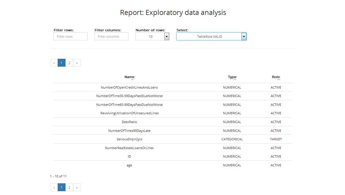
The result table regarding the training sample includes:
- Name: variable’s name
- Type: variable’s type (categorical or numerical)
- Role: variable’s role (Active / Obligatory / Target / ID, details on variable’s roles can be found in Chapter Step 3: Entering variables settings)
You can also sort data by column from lowest to highest and vice versa.
Report #5: Variables selection
This report shows statistics concerning variables chosen for further analysis, based on the strength of their relation with the dependent variable and other independent variables.
Statistics for training sample
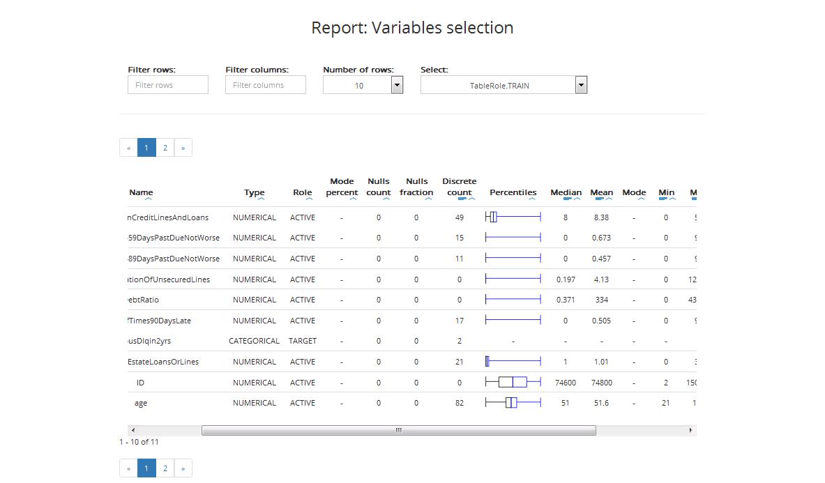
The table includes:
- Name: variable’s name
- Type: variable’s type (categorical or numerical)
- Role: variable’s role (Active / Obligatory / Target / ID, details on variable’s roles can be found in Chapter Step 3: Entering variables settings)
- Mode percent: The mode is the value that appears most often in a set of data. Mode percent is the percent of mode value in the set
- Nulls count: number of nulls
- Nulls fraction: fraction of nulls in the dataset
- Discrete count: maximum number of levels for categorical variables. Variables with more levels will be ignored in the further modelling process
- Percentiles: box plot, where
- Boxplot depicts 1st and 3rd quartiles
- Middle vertical line depicts median
- Whiskers depict variability outside the upper and lower quartiles (the longer they are the stronger the skewness in the given direction)
- Points depict outliers
- Median: the middle number of the group when they are ranked in order
- Mean: the sum of the values divided by the number of values
- Mode: the most frequent value in a data set
- Minimum (Min): minimal value of the given variable
- Maximum (Max): maximal value of the given variable
- Standard Deviation: a measure that is used to quantify the amount of variation or dispersion of a set of data values
- Score: a measure of the predictive power of a variable computed by the feature selection algorithm
You can filter the information in the table by:
- Rows: select only those rows where variables names contain letters you typed in the filter
- Columns: display only selected columns
- Number of rows: display selected number of rows
You can also sort each column in the table from lowest to highest and vice versa by value or absolute value and see data visualisation.
Statistics for validation sample
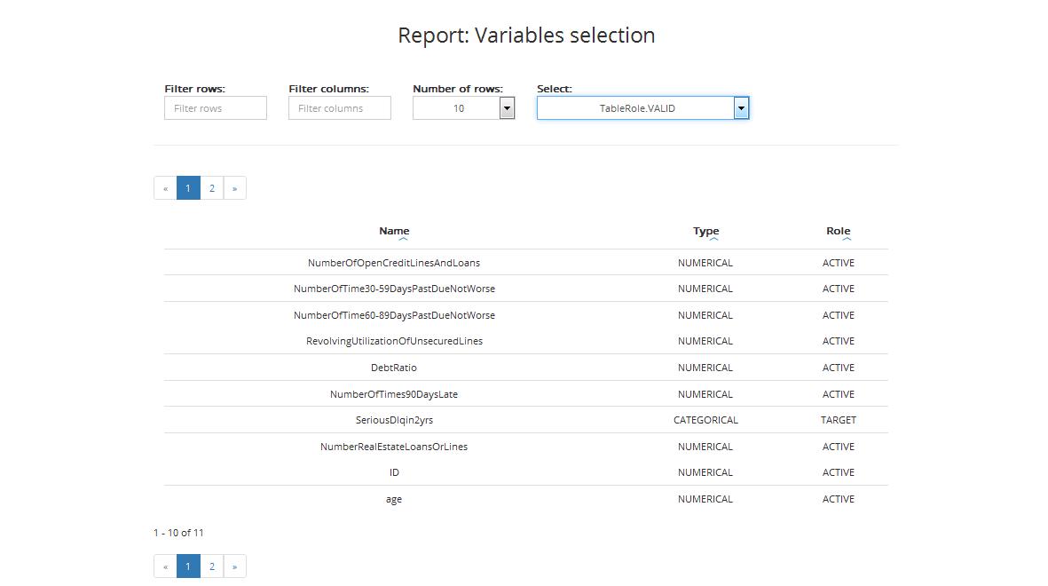
The table for validation sample includes:
- Name: variable’s name
- Type: variable’s type (categorical or numerical)
- Role: variable’s role (Active / Obligatory / Target / ID, details on variable’s roles can be found in Chapter Step 3: Entering variables settings)
You can also sort data from lowest to highest and vice versa by column.
Other statistics (feature selection statistics)
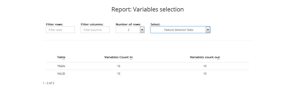
The table includes:
- Name: table: data category: training data (TRAIN), validation data (VALID)
- Variables CountIn: number of variables before feature selection
- Variables CountOut: number of variables chosen as the best target predictors for further processing and model construction
You can also sort data from lowest to highest and vice versa by column.
Report #6: Model statistics for classification
This report shows statistics concerning the model fit for training and validation samples.
Variables information
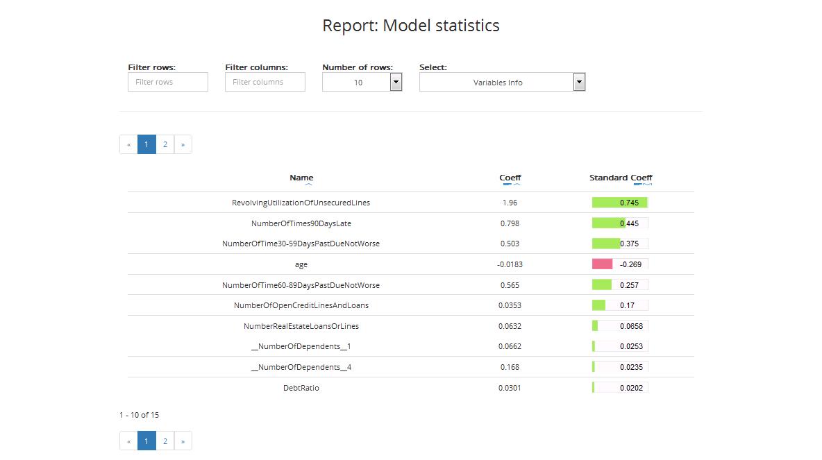
The table includes:
- Name: names of variables that were included in the final model (best predictors)
- Coefficient: value of the variable’s coefficient in the model
- Standard coefficient: standardised value of the variable’s coefficient in the model
In Advanced and Gold modes, variable importance can be displayed (entropy or Gini coefficient) instead of the coefficients, depending on the final algorithm chosen by ABM.
You can filter the information in the table by:
- Rows: select only those rows where variables names contain letters you typed in the filter
- Columns: display only selected columns
- Number of rows: display selected number of rows
You can sort data from lowest to highest and vice versa by column and see data visualisation. You can also sort by absolute value of the standard coefficient (the highest value, the highest significance of the variable).
Model statistics
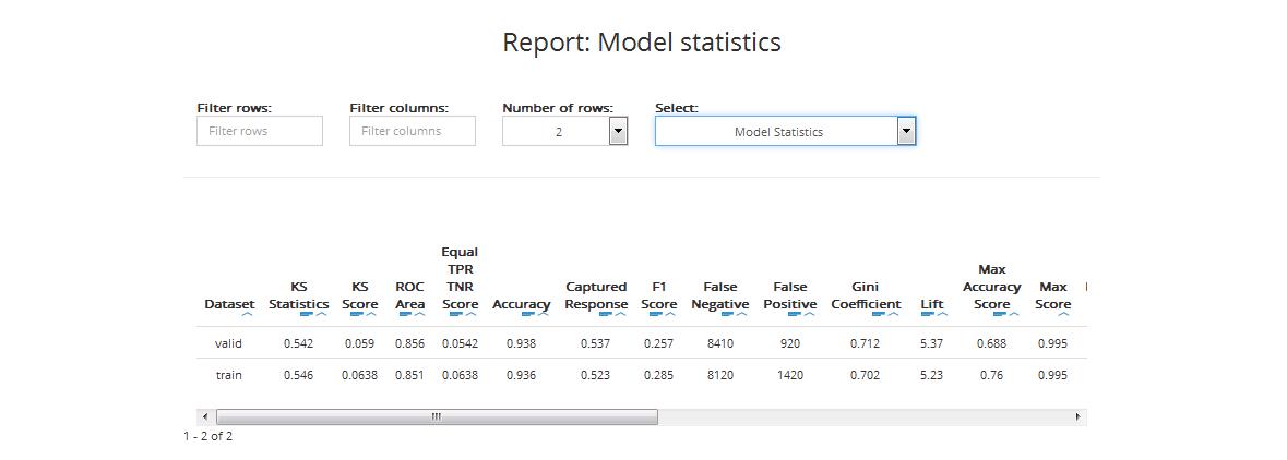
The table includes statistics for training and validation datasets:
KS Statistics: The Kolmogorov-Smirnov statistic is a measure of the degree of separation between the positive and negative distributions. The higher the value the better the model separates the positive cases from negative cases
KS Score: the value of the probability threshold which ensures the highest separation between the positive and negative distributions
ROC Area (AUC): area under ROC Curve (AUC) coefficient. The higher the value of AUC coefficient, the better. AUC = 1 means a perfect classifier, AUC = 0.5 is obtained for purely random classifiers. AUC < 0.5 means the classifier performs worse than a random classifier
Equal TPR TNR Score: the value of the probability threshold for which the True Positive Rate and the True Negative Rate are equal
Accuracy (ACC): reflects the classifier’s overall prediction correctness, i.e. the probability of making the correct prediction, equal to the ratio of the number of correct decisions to the total number of decisions:
ACC = (TP + TN) / (TP + TN + FP + FN)
Captured Response: is the fraction of positive cases captured in the given percentile of the data (the data is sorted by descending score values)
Cut-off Score: the score used to calculate the number of TP, TN, FP and FN in the reports. Its value depends on the Classification threshold settings chosen when creating the project
F1 Score: the F1 score (also F score or F measure) is a measure of the model accuracy. It considers both the precision (see the definition below) and the recall (see the definition below) to compute the score. The F1 score can be interpreted as a weighted average of the precision and recall, where an F1 score reaches its best value at 1 and worst at 0
False Negative (FN): the number of observations assigned by the model to the negative class, that in reality belong to the positive class
False Positive (FP): the number of observations assigned by the model to the positive class, that in reality belong to the negative class
Gini Coefficient (GC): shows the classifier’s advantage over a purely random one. GC = 1 denotes a perfect classifier, GC = 0 denotes a purely random one. The higher the value of GC, the better
\(GC = 2AUC - 1\)
Lift: visualises gains from applying a classification model in comparison to not applying it (i.e. using a random classifier) for a given percentage of the data (the data is sorted by descending score values)
LIFT = Y% / p%
Y%: density of positive observations among the first X% observations with the highest score (appointed by cut-off)
p%: density of positive observations among all observations
Max Accuracy Score: the value of the probability threshold which ensures the maximal model accuracy
Max Score: maximum score (predicted probability) value
Max Profit Score: the value of the score threshold (probability threshold) which maximizes the profit value (based on the specified Profit matrix)
Min Distance Score: the value of the score threshold (probability threshold) which ensures the minimum distance from (0,1) on the ROC curve
Min Score: minimum score (predicted probability) value
Number of Quantiles: number of cutpoints dividing a given dataset into equal sized groups
Precision: the number of correct positive results divided by the number of all positive results.
TP = TP / (TP + FP)
Profit: the profit calculated based on the specified Profit matrix and the number of TP, TN, FP and FN.
\(Profit = TP * TPP + TN * TNP + FP * FPP + FN * FNP\)
where TPP is the True Positive Profit, TNP is the True Negative Profit, FPP is the False Positive Profit and FNP is the False Negative Profit
Recall: the number of correct positive results divided by the number of positive results that should have been returned
RECALL = TP / (TP + FN)
Suggested Score: the value of the score threshold (probability threshold) suggested by ABM to be used to classify new data during the scoring task (the user can manually change the threshold when scoring). In case of Classification quality measure set to PROFIT this will be the score that maximizes the profit
Total Cases: the number of all observations from the positive and negative classes
Total Negative Cases (Neg): the number of all observations from the negative class
Total Positive Cases (Pos): the number of all observations from the positive class
True Negative (TN): the number of observations correctly assigned to the negative class
True Positive (TP): the number of observations correctly assigned to the positive class
You can filter the information in the table by:
- Rows: select only those rows where variables names contain given letters
- Columns: display only selected columns
- Number of rows: display selected number of rows
You can also sort each column in the table from lowest to highest and vice versa by value or absolute value and see the data visualisation.
Models comparison
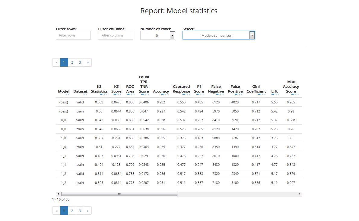
The table enables you to compare the performance of various models built by ABM during the project. The comparison covers:
- Best train: statistics based on validation data for the best model
- Best valid: statistics based on training data for the best model
- XX.YY statistics for model nr XX.YY (based on training and validation data): YY is usually 0 except for models that can internally build more than one model
The table includes the following statistics:
KS Statistics: The Kolmogorov-Smirnov statistic is a measure of the degree of separation between the positive and negative distributions. The higher the value the better the model separates the positive cases from negative cases
KS Score: the value of the probability threshold which ensures the highest separation between the positive and negative distributions
ROC Area (AUC): area under ROC Curve (AUC) coefficient. The higher the value of AUC coefficient, the better. AUC = 1 means a perfect classifier, AUC = 0.5 is obtained for purely random classifiers. AUC < 0.5 means the classifier performs worse than a random classifier
Equal TPR TNR Score: the value of the probability threshold for which the True Positive Rate and the True Negative Rate are equal
Accuracy (ACC): reflects the classifier’s overall prediction correctness, i.e. the probability of making the correct prediction, equal to the ratio of the number of correct decisions to the total number of decisions:
ACC = (TP + TN) / (TP + TN + FP + FN)
Captured Response: is the fraction of positive cases captured in the given percentile of the data (the data is sorted by descending score values)
F1 Score: the F1 score (also F score or F measure) is a measure of the model accuracy. It considers both the precision (see the definition below) and the recall (see the definition below) to compute the score. The F1 score can be interpreted as a weighted average of the precision and recall, where an F1 score reaches its best value at 1 and worst at 0
False Negative (FN): the number of observations assigned by the model to the negative class, that in reality belong to the positive class
False Positive (FP): the number of observations assigned by the model to the positive class, that in reality belong to the negative class
Gini Coefficient (GC): shows the classifier’s advantage over a purely random one. GC = 1 denotes a perfect classifier, GC = 0 denotes a purely random one. The higher the value of GC, the better
\(GC = 2AUC - 1\)
Lift: visualises gains from applying a classification model in comparison to not applying it (i.e. using a random classifier) for a given percentage of the data (the data is sorted by descending score values)
LIFT = Y% / p%
Y%: density of positive observations among the first X% observations with the highest score (appointed by cut-off)
p%: density of positive observations among all observations
Max Accuracy Score: the value of the probability threshold which ensures the maximal model accuracy
Max Score: maximum score (predicted probability) value
Min Distance Score: the value of the score threshold (probability threshold) which ensures the minimum distance from (0,1) on the ROC curve
Min Score: minimum score (predicted probability) value
Number of Quantiles: number of cutpoints dividing a given dataset into equal sized groups
Precision: the number of correct positive results divided by the number of all positive results.
TP = TP / (TP + FP)
Recall: the number of correct positive results divided by the number of positive results that should have been returned
RECALL = TP / (TP + FN)
Total Cases: the number of all observations from the positive and negative classes
Total Negative Cases (Neg): the number of all observations from the negative class
Total Positive Cases (Pos): the number of all observations from the positive class
True Negative (TN): the number of observations correctly assigned to the negative class
True Positive (TP): the number of observations correctly assigned to the positive class
You can filter the information in the table by:
- Rows: select only those rows where variables names contain letters typed in the filter
- Columns: display only selected columns
- Number of rows: display selected number of rows
You can also sort each data column in the table from lowest to highest and vice versa by value or absolute value and see data visualisation.
Graphs
The report includes the Profit Curve (optional), the Cumulative Lift Curve, the Cumulative Captured Response Curve, and the ROC curve for training and validation datasets.
- Profit Curve: measures the expected profit from using the model, calculated based on the specified Profit matrix. The x-axis shows the percentiles of the data sorted by decreasing score from the model. The y-axis shows the profit for the given score threshold (probability threshold).
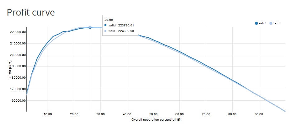
e.g. Profit = 223 795,01 EURO on the 26th percentile means that if we take 26% of the observations with the highest score we will reach 223 795,01 EURO profit.
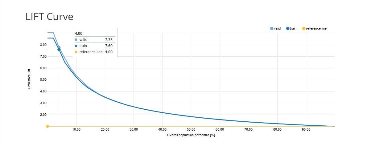
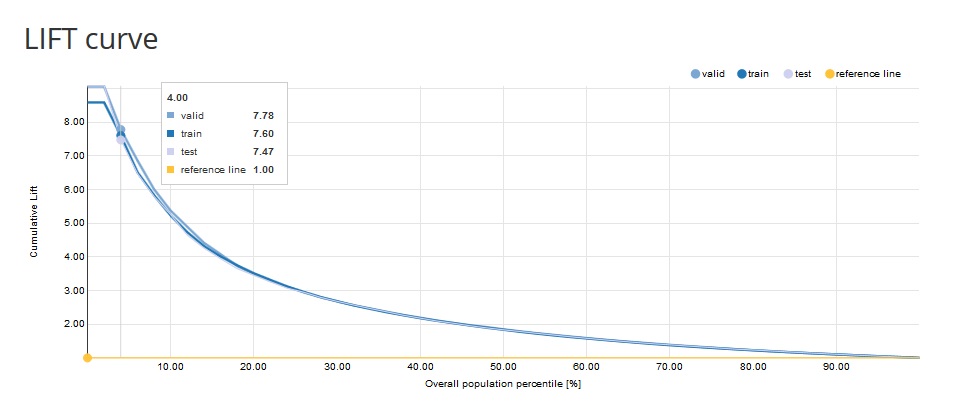
Cumulative Lift Curve: measures the effectiveness of a predictive model as the ratio between the results obtained with and without the predictive model.
The x-axis shows the percentiles of the data sorted by decreasing score from the model. The y-axis shows the ratio between the cumulative number of positive cases predicted by the model and the a priori probability of a positive case in the data. e.g. Cumulative lift = 3 on the 10th percentile means that in the first 10% of the data we reach 3 times more positive cases when using the model compared to using no model
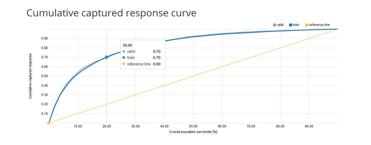
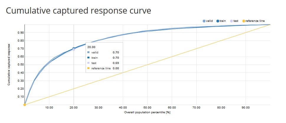
- Cumulative Captured Response Curve (CCR): the x-axis shows the percentiles of the data sorted by decreasing score from the model. The y-axis shows the percentage of positive target values reached so far. e.g. CCR = 40% on the 10th percentile means that if we take 10% of the observations with the highest score we will reach 40% of all the positive target values
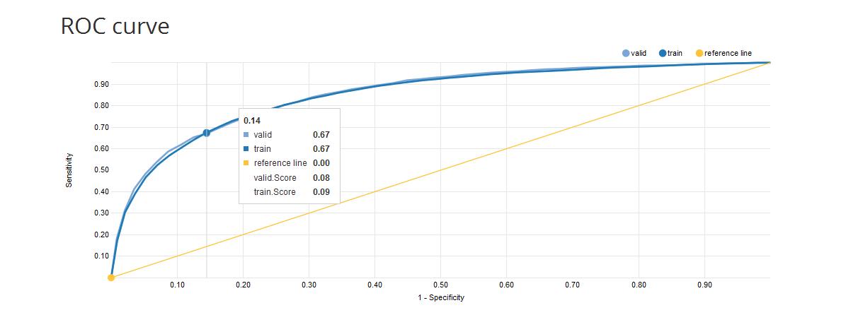
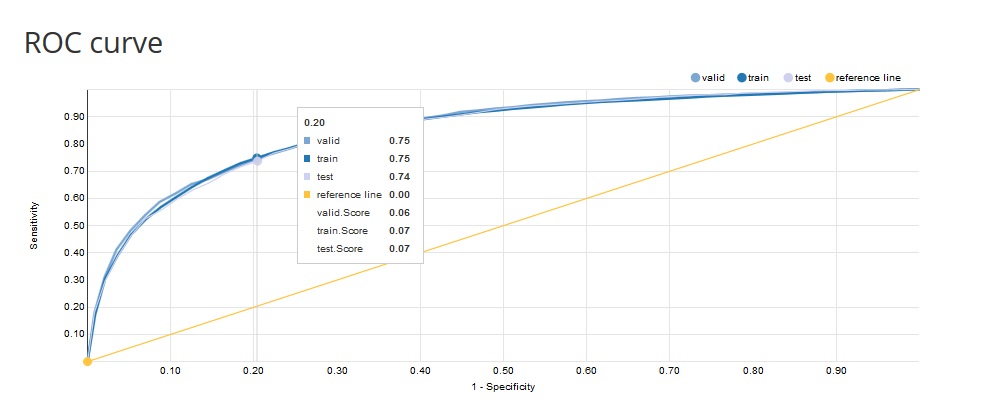
ROC curve: one of the methods for visualising classification quality that shows the dependency between TPR (True Positive Rate) and FPR (False Positive Rate).
The curve is created by plotting the true positive rate (TPR) against the false positive rate (FPR) at various score thresholds (probability thresholds). TPR is also known as sensitivity or recall and FPR is also known as (1 - specificity).
The best possible prediction method would yield a point in the upper left corner or coordinate (0,1) of the ROC space, representing 100% sensitivity (no false negatives) and 100% specificity (no false positives).
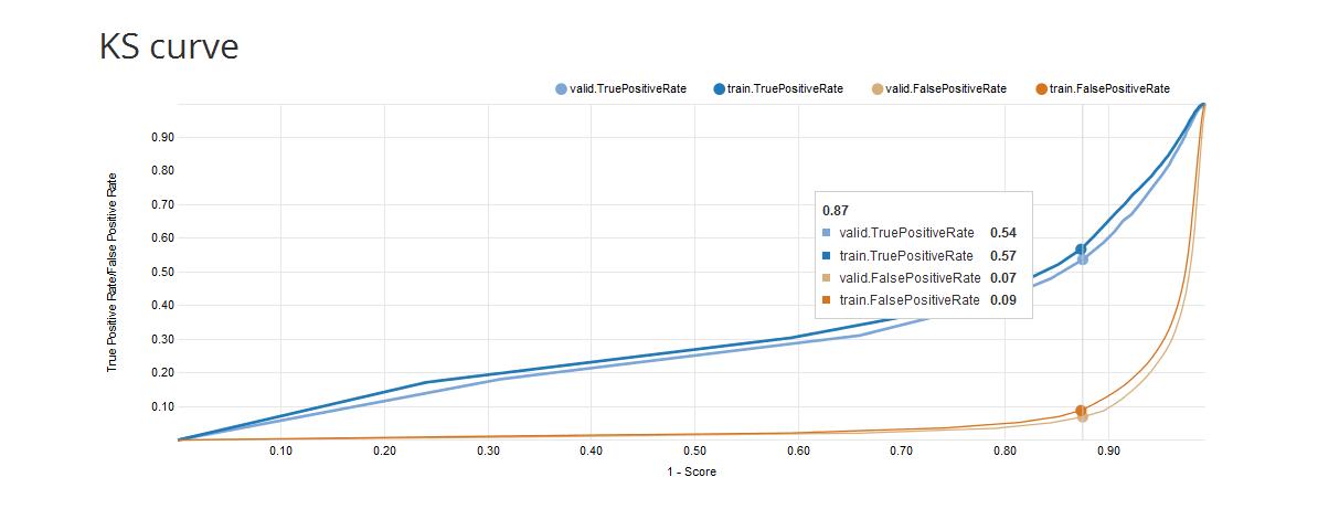
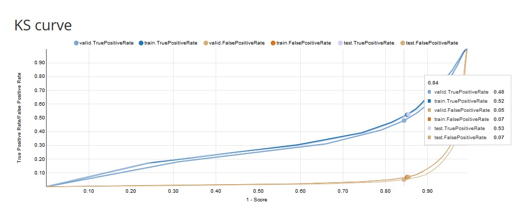
- KS curve: the KS curve shows the difference between the TPR (True Positive Rate) and the TNR (True Negative Rate) for a given value of the probability threshold (score). A bigger difference implies a better separation between the positive and negative distributions. The x-axis shows 1-Score and the y-axis shows the TPR (True Positive Rate) and the TNR (True Negative Rate) for each data sample (train, valid).
Report #6: Model statistics for approximation
This report shows statistics concerning the model fit for training and validation samples.
Variables information
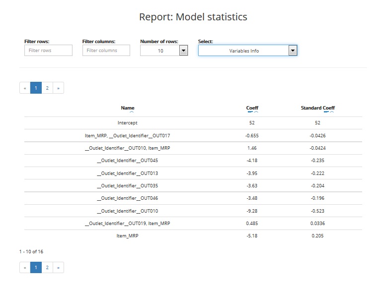
The table includes:
- Name: names of variables that were included in the final model (best predictors)
- Coefficient: value of the variable’s coefficient in the model
- Standard coefficient: standardised value of the variable’s coefficient in the model
You can filter the information in the table by:
- Rows: select only those rows where variables names contain letters you typed in the filter
- Columns: display only selected columns
- Number of rows: display selected number of rows
You can sort data from lowest to highest and vice versa by column and see data visualisation. You can also sort by absolute value of the standard coefficient (the highest value, the highest significance of the variable).
Model statistics
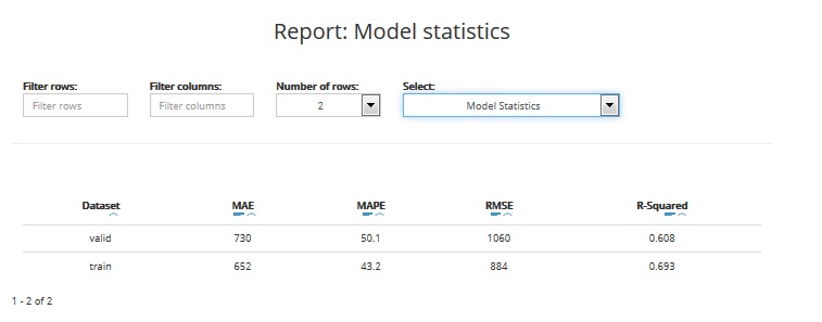
The table includes statistics for training and validation datasets:
- MEAN ABSOLUTE ERROR: the mean absolute error (MAE) is a quantity used to measure how close are the predictions to the real target values. This statistic takes a value between 0 and infinity. The closer to 0, the better is the model quality
- MEAN ABSOLUTE PERCENTAGE ERROR: the mean absolute percentage error (MAPE) is a measure of prediction accuracy. This statistic takes a value between 0 and 1 (or 0 - 100%). The closer to 0, the better is the model quality
- ROOT MEAN SQUARE ERROR: the root-mean-square error (RMSE) is another measure of the prediction accuracy. It represents the sample standard deviation of the differences between the predictions and the real target values. This statistic takes a value between 0 and infinity. The closer to 0, the better is the model quality
- R-SQUARED: the coefficient of determination, denoted R2 (R-squared), is a measure that indicates the proportion of the variance in the predicted target variable that is explained by the model. It gives information about the goodness of fit of a model. This statistic takes a value between 0 and 1 (or 0 - 100%). The closer to 1, the better is the model quality. A value of 1 means the model perfectly fitted, a value of 0 means the model doesn’t explain the data
You can filter the information in the table by:
- Rows: select only those rows where variables names contain given letters
- Columns: display only selected columns
- Number of rows: display selected number of rows
You can also sort each column in the table from lowest to highest and vice versa by value or absolute value and see the data visualisation.
Models comparison
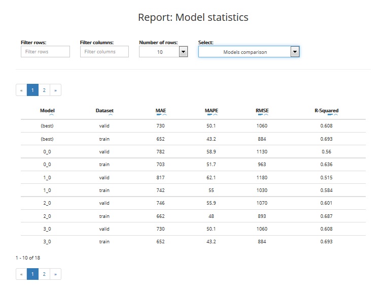
The table enables you to compare the performance of various models built by ABM during the project. The comparison covers:
- Best train: statistics based on validation data for the best model
- Best valid: statistics based on training data for the best model
- XX.YY statistics for model nr XX.YY (based on training and validation data): YY is usually 0 except for models that can internally build more than one model
The table includes the following statistics:
- MEAN ABSOLUTE ERROR: the mean absolute error (MAE) is a quantity used to measure how close are the predictions to the real target values. This statistic takes a value between 0 and infinity. The closer to 0, the better is the model quality
- MEAN ABSOLUTE PERCENTAGE ERROR: the mean absolute percentage error (MAPE) is a measure of prediction accuracy. This statistic takes a value between 0 and 1 (or 0 - 100%). The closer to 0, the better is the model quality
- ROOT MEAN SQUARE ERROR: the root-mean-square error (RMSE) is another measure of the prediction accuracy. It represents the sample standard deviation of the differences between the predictions and the real target values. This statistic takes a value between 0 and infinity. The closer to 0, the better is the model quality
- R-SQUARED: the coefficient of determination, denoted R2 (R-squared), is a measure that indicates the proportion of the variance in the predicted target variable that is explained by the model. It gives information about the goodness of fit of a model. This statistic takes a value between 0 and 1 (or 0 - 100%). The closer to 1, the better is the model quality. A value of 1 means the model perfectly fitted, a value of 0 means the model doesn’t explain the data
You can filter the information in the table by:
- Rows: select only those rows where variables names contain letters typed in the filter
- Columns: display only selected columns
- Number of rows: display selected number of rows
You can also sort each data column in the table from lowest to highest and vice versa by value or absolute value and see data visualisation.
Report #7: Test statistics for classification projects
Model statistics
This report shows statistics regarding model fit for the test sample. The table includes:
KS Statistics: The Kolmogorov-Smirnov statistic is a measure of the degree of separation between the positive and negative distributions. The higher the value the better the model separates the positive cases from negative cases
KS Score: the value of the probability threshold which ensures the highest separation between the positive and negative distributions
ROC Area (AUC): area under ROC Curve (AUC) coefficient. The higher the value of AUC coefficient, the better. AUC = 1 means a perfect classifier, AUC = 0.5 is obtained for purely random classifiers. AUC < 0.5 means the classifier performs worse than a random classifier
Equal TPR TNR Score: the value of the probability threshold for which the True Positive Rate and the True Negative Rate are equal
Accuracy (ACC): reflects the classifier’s overall prediction correctness, i.e. the probability of making the correct prediction, equal to the ratio of the number of correct decisions to the total number of decisions:
ACC = (TP + TN) / (TP + TN + FP + FN)
Captured Response: is the fraction of positive cases captured in the given percentile of the data (the data is sorted by descending score values)
Cut-off Score: the score used to calculate the number of TP, TN, FP and FN in the reports. Its value depends on the Classification threshold settings chosen when creating the project
F1 Score: the F1 score (also F score or F measure) is a measure of the model accuracy. It considers both the precision (see the definition below) and the recall (see the definition below) to compute the score. The F1 score can be interpreted as a weighted average of the precision and recall, where an F1 score reaches its best value at 1 and worst at 0
False Negative (FN): the number of observations assigned by the model to the negative class, that in reality belong to the positive class
False Positive (FP): the number of observations assigned by the model to the positive class, that in reality belong to the negative class
Gini Coefficient (GC): shows the classifier’s advantage over a purely random one. GC = 1 denotes a perfect classifier, GC = 0 denotes a purely random one. The higher the value of GC, the better
\(GC = 2AUC - 1\)
Lift: visualises gains from applying a classification model in comparison to not applying it (i.e. using a random classifier) for a given percentage of the data (the data is sorted by descending score values)
LIFT = Y% / p%
Y%: density of positive observations among the first X% observations with the highest score (appointed by cut-off)
p%: density of positive observations among all observations
Max Accuracy Score: the value of the probability threshold which ensures the maximal model accuracy
Max Score: maximum score (predicted probability) value
Max Profit Score: the value of the score threshold (probability threshold) which maximizes the profit value (based on the specified Profit matrix)
Min Distance Score: the value of the score threshold (probability threshold) which ensures the minimum distance from (0,1) on the ROC curve
Min Score: minimum score (predicted probability) value
Number of Quantiles: number of cutpoints dividing a given dataset into equal sized groups
Precision: the number of correct positive results divided by the number of all positive results.
TP = TP / (TP + FP)
Profit: the profit calculated based on the specified Profit matrix and the number of TP, TN, FP and FN.
\(Profit = TP * TPP + TN * TNP + FP * FPP + FN * FNP\)
where TPP is the True Positive Profit, TNP is the True Negative Profit, FPP is the False Positive Profit and FNP is the False Negative Profit
Recall: the number of correct positive results divided by the number of positive results that should have been returned
RECALL = TP / (TP + FN)
Suggested Score: the value of the score threshold (probability threshold) suggested by ABM to be used to classify new data during the scoring task (the user can manually change the threshold when scoring). In case of Classification quality measure set to PROFIT this will be the score that maximizes the profit
Total Cases: the number of all observations from the positive and negative classes
Total Negative Cases (Neg): the number of all observations from the negative class
Total Positive Cases (Pos): the number of all observations from the positive class
True Negative (TN): the number of observations correctly assigned to the negative class
True Positive (TP): the number of observations correctly assigned to the positive class
You can filter the information in the table by:
- Rows: select only those rows where variables names contain given letters
- Columns: display only selected columns
- Number of rows: display selected number of rows
You can also sort each column in the table from lowest to highest and vice versa by value or absolute value and see the data visualisation.
Graphs
The report includes the Profit Curve (optional), the Cumulative Lift Curve, the Cumulative Captured Response Curve, and the ROC curve for training and validation datasets.
- Profit Curve: measures the expected profit from using the model, calculated based on the specified Profit matrix. The x-axis shows the percentiles of the data sorted by decreasing score from the model. The y-axis shows the profit for the given score threshold (probability threshold).
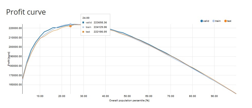
e.g. Profit = 222 186,05 EURO on the 24th percentile means that if we take 24% of the observations with the highest score we will reach 222 186,05 EURO profit.
Cumulative Lift Curve: measures the effectiveness of a predictive model as the ratio between the results obtained with and without the predictive model.
The x-axis shows the percentiles of the data sorted by decreasing score from the model. The y-axis shows the ratio between the cumulative number of positive cases predicted by the model and the a priori probability of a positive case in the data. e.g. Cumulative lift = 3 on the 10th percentile means that in the first 10% of the data we reach 3 times more positive cases when using the model compared to using no model
- Cumulative Captured Response Curve (CCR): the x-axis shows the percentiles of the data sorted by decreasing score from the model. The y-axis shows the percentage of positive target values reached so far. e.g. CCR = 40% on the 10th percentile means that if we take 10% of the observations with the highest score we will reach 40% of all the positive target values
ROC curve: one of the methods for visualising classification quality that shows the dependency between TPR (True Positive Rate) and FPR (False Positive Rate).
The curve is created by plotting the true positive rate (TPR) against the false positive rate (FPR) at various score thresholds (probability thresholds). TPR is also known as sensitivity or recall and FPR is also known as (1 - specificity).
The best possible prediction method would yield a point in the upper left corner or coordinate (0,1) of the ROC space, representing 100% sensitivity (no false negatives) and 100% specificity (no false positives).
- KS curve: the KS curve shows the difference between the TPR (True Positive Rate) and the TNR (True Negative Rate) for a given value of the probability threshold (score). A bigger difference implies a better separation between the positive and negative distributions. The x-axis shows 1-Score and the y-axis shows the TPR (True Positive Rate) and the TNR (True Negative Rate) for each data sample (train, valid).
Report #7: Test statistics for approximation projects
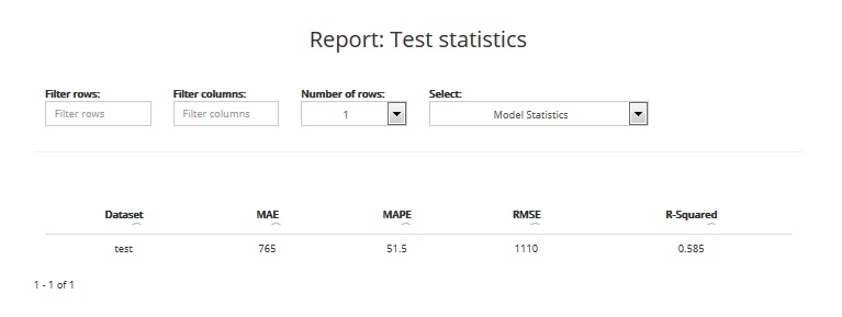
This report shows statistics regarding model fit for the test sample. The table includes:
- MEAN ABSOLUTE ERROR: the mean absolute error (MAE) is a quantity used to measure how close are the predictions to the real target values. This statistic takes a value between 0 and infinity. The closer to 0, the better is the model quality
- MEAN ABSOLUTE PERCENTAGE ERROR: the mean absolute percentage error (MAPE) is a measure of prediction accuracy. This statistic takes a value between 0 and 1 (or 0 - 100%). The closer to 0, the better is the model quality
- ROOT MEAN SQUARE ERROR: the root-mean-square error (RMSE) is another measure of the prediction accuracy. It represents the sample standard deviation of the differences between the predictions and the real target values. This statistic takes a value between 0 and infinity. The closer to 0, the better is the model quality
- R-SQUARED: the coefficient of determination, denoted R2 (R-squared), is a measure that indicates the proportion of the variance in the predicted target variable that is explained by the model. It gives information about the goodness of fit of a model. This statistic takes a value between 0 and 1 (or 0 - 100%). The closer to 1, the better is the model quality. A value of 1 means the model perfectly fitted, a value of 0 means the model doesn’t explain the data
You can filter the information in the table by:
- Rows: select only those rows where variables names contain given letters
- Columns: display only selected columns
- Number of rows: display selected number of rows
You can also sort each column in the table from lowest to highest and vice versa by value or absolute value and see the data visualisation.